The Project: An album pre-order website
Project Duration: March 2023-April 2023
My Role: UX Designer from conception to delivery
Responsibilities: conducting interviews, paper and digital wire framing, low and high-fidelity prototyping, conducting usability studies, accounting for accessibility, and iterating on designs
The Problem: Users missing album releases
Project Vision: A website to notify, accept pre-orders, and track album delivery
Research Study
I conducted interviews and created empathy maps to understand the users I was designing for and their needs. A primary user group identified through research was busy adults who are unaware of new albums released by their favorite artists.
This user group helped solidify assumptions about participants' busy schedules, but research showed many other reasons for being unaware of new releases. Problems included a lack of coverage in mainstream media, oblivious to local shows to buy albums in person, as well as theories of social media algorithms.
The most common pain points were:
1. Securing: It can be difficult to find a local record store, navigate there, find parking, and locate an album in the store
2. Availability: Despite the recent successes of vinyl, it is still hard to find online, as well as networks that distribute it
3. Awareness: Fans are not aware of new releases from their favorite artists nor aware of local performances
Initial Concepts
In the Paper wireframes the aim was to keep the album front and center, and make the main user flow as easy as possible. The stars represent parts to use in an initial digital wireframe.
Digital Wireframes
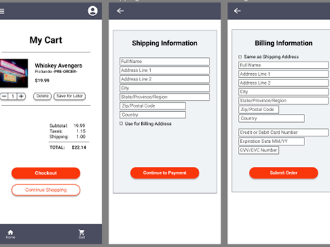
With the digital wireframes I wanted the content and organization to remain consistent. A simple layout and big buttons to assist the user main flow.
User Testing
The low-fidelity prototype for the primary user flow was connected and designed based on insight from user studies and suggestions.
You can view the low-fidelity prototype here.
Results
Through the usability studies I found that having a pop-up letting users know an item was added then giving them the option to continue shopping helped improve the user experience.
We also found it easier to have a drop-down cart, so the user could check on what they had in the cart without changing pages.
Final Designs
The user flow for the website mimics that of the original usability study.
You can view the high-fidelity prototype here.
Impact:
The app puts the user front and center, providing a quick and convenient way to pre-order and track vinyl purchases. A quote from a user: “The app is extremely easy to use, and pretty useful for dedicated fans.
What I learned:
While designing this album pre-order app, I learned the value of iteration, and the power of usability studies, to help focus my designs and keep the user and user flow as top priority.

