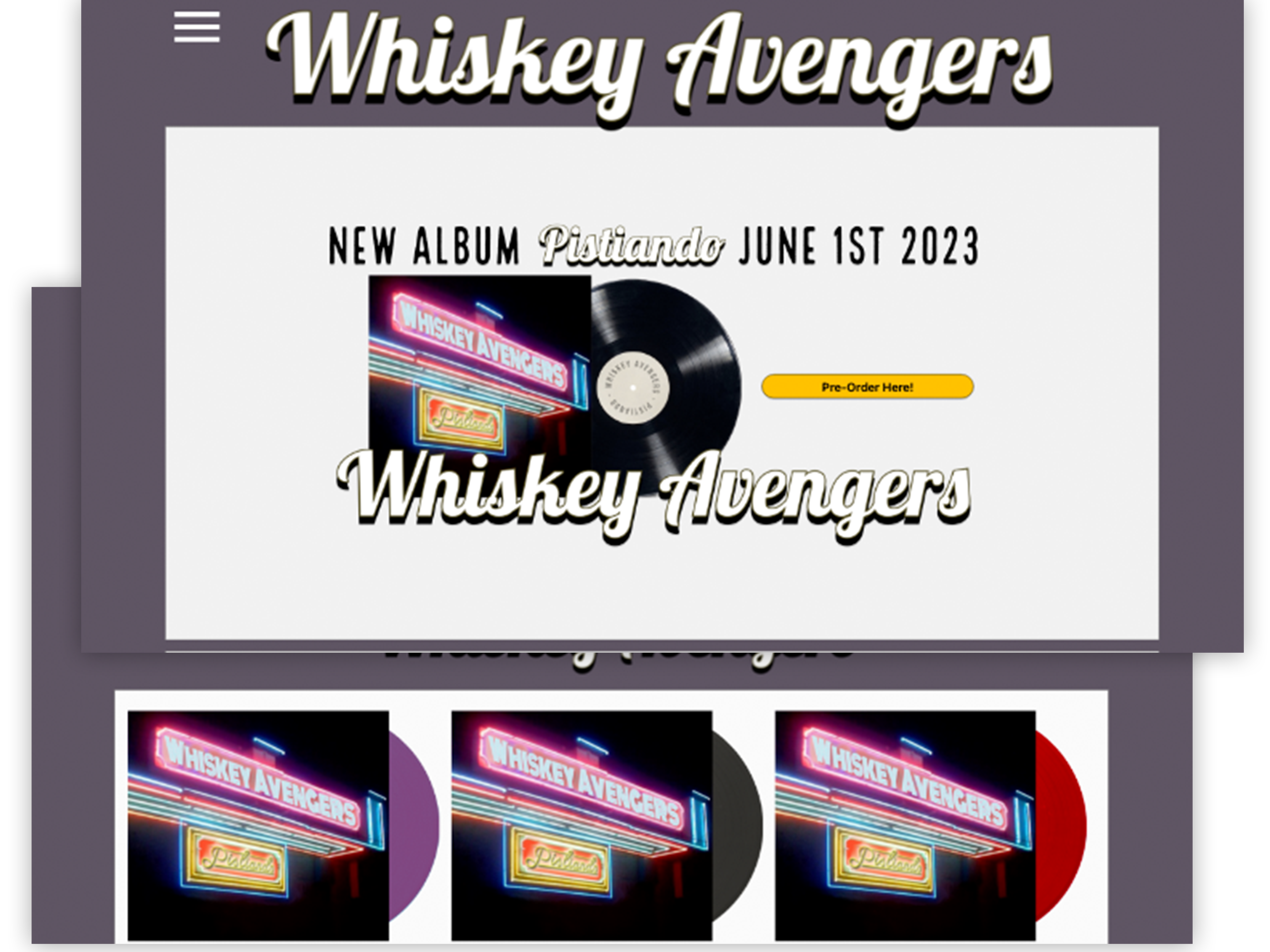
The Project: An album pre-order application
Project Duration: March 2023-April 2023
My Role: UX Designer from conception to delivery
Responsibilities: conducting interviews, paper and digital wire framing, low and high-fidelity prototyping, conducting usability studies, accounting for accessibility, and iterating on designs
The Problem: Users missing album releases
Project Vision: An app to notify, accept pre-orders, and track album delivery
Research Study
I conducted interviews and created empathy maps to understand the users I was designing for and their needs. A primary user group identified through research was busy adults who are unaware of new albums released by their favorite artists.
This user group helped solidify assumptions about participants' busy schedules, but research showed many other reasons for being unaware of new releases. Problems included a lack of coverage in mainstream media, oblivious to local shows to buy albums in person, as well as theories of social media algorithms.
The most common pain points were:
1. Securing: It can be difficult to find a local record store, navigate there, find parking, and locate an album in the store
2. Availability: Despite the recent successes of vinyl, it is still hard to find online, as well as networks that distribute it
3. Awareness: Fans are not aware of new releases from their favorite artists nor aware of local performances
Initial Concepts
To tackle the pain points, trying different iterations helped me try place options that best suited the users needs . For the homepage I wanted large graphics that informed as well as made the pre-order process easier.
Digital Wireframes
The initial layout design focuses on pain points found during user research.
User Testing
The low-fidelity prototype for the primary user flow was connected and used in a usability study.
View the low-fidelity prototype.
Results
The first design had a pre-order form on the Album Information page. Users found this strange, so I changed it to a typical “Add to Cart” button instead, giving the user more control over the transaction.
Through the next round of improvements quantity options, “Delete”, and “Save for Later” buttons, were added to help users customize their carts.
The Final Design
The high-fidelity prototype has a logical user flow to help users as well as the ability to purchase multiple items.
View the high-fidelity prototype.
Impact:
The app puts the user front and center, providing a quick and convenient way to pre-order and track vinyl purchases.
A quote from a user:
“The app is extremely easy to use, and pretty useful for dedicated fans.”
What I learned:
While designing this album pre-order app, I learned the value of iteration, and the power of usability studies, to help focus my designs and keep the user and user flow as top priority.

